Website and mobile
site redesign for

SCOPE
Exam project for
Talent Garden
UX Design course
MY ROLE
TIMELINE
2-3 weeks
TOOLS
OVERVIEW
This was a case study for UX and Graphic Design course hosted by Talent Garden which is part of KEA university based in Copenhagen, Denmark. The goal of the project was to redesign a self chosen website using Design Thinking and to make it user friendly for web and mobile. The aim was to redesign 2 pages of the chosen website.
ABOUT BRYG COFFEE HOUSE
BRYG Coffee House is a modern coffee shop in the heart of Vejle, Denmark that offers not only delicious coffee to its customers, but also services like coffee tastings and coffee wagon that drives out to different events.
BRYG Coffee House has a website but the website does not reflect all the services that the coffee shop offers and the information offered in the website needs to be more visible to the users. Also the coffee shop would like to have a coffee webshop in the future.
CHALLANGES
How to effectively implement the needed features/services so they are easy to find and use?
How to redesign the website to make it user friendly and attractive?

1. PRODUCT DEFINITION

Stakeholder Interviews
At the start of the project I conducted a projects’ stakeholder interview. I interviewed the owner of the Coffee House BRYG to find out more about the business and the role of the website and how can we improve it. During the interview we discussed questions like:
– expectations from the project – things that need to solved
– goal of the website
– who are the users
– main competitors
– how is the company different/ better then competitors
– products/services to implement in the website – brand guidelines
From the interview I found out there are many things that needs to be implemented in the website redesign. The main features to be included are:
– information about clip card (klippekort) – book a table button
– web-shop
– sell tickets to coffee tasting
– update coffee wagon (kaffevogn) page with needed information – button to change language to English
Value Proposition Mapping
In order to understand what the website users/ Coffee House BRYG customers want and to make sure I create value for customers, I created Value Proposition Map.
Information Architecture
In order to understand the types of pages already exist on the website and how the information is organized I conducted Page Type Inventory (As-Is). Drawing from that information I reorganized the pages and added the pages that need to be implemented in Page Type Inventory (To-Be). I tried to create an simple structure of the website, so that the user can easily search for needed information.
2. REASEARCH

Quantitative Research
I chose to conduct primary quantitative research (market research) to collect information from existing and future customers to investigate their habits, actions and expectations from a coffee shop and its website. I created my own survey and targeted people living in Vejle, to get the best/precise results.
I created an online survey to collect the needed information. The aim of this survey was to sort out all the information and features that need to be implemented on the website. Also, to see which ones needs to be prioritize, which coffee shops and why are seen as competitors etc. The results of the survey will impact the design of the website.
3. ANALYSIS

User Persona Development
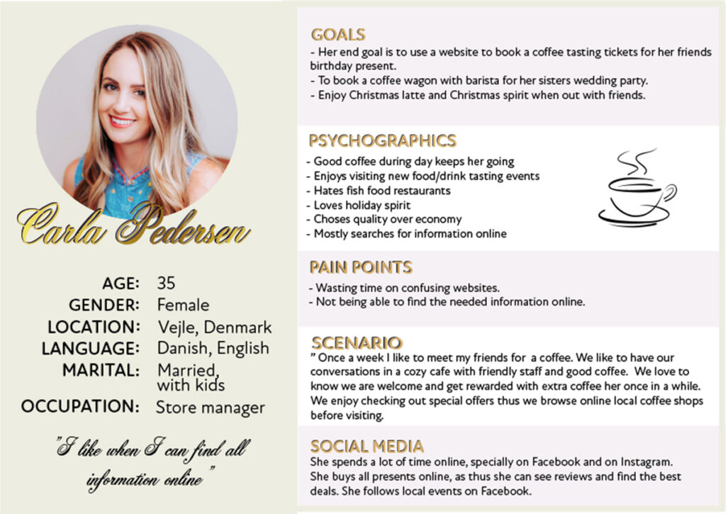
After user research I defined what the users need from the website that I am designing. Using the results of my survey and the information the coffee house BRYG have given me I created a User Persona for the most important user group. Main target group User Persona points out the goals of the user, psychographics, pain points, scenario and the use of social media. User Persona focuses on two pain points of the main target group which I will try to solve.
The User Persona shows my ideal user and that will help me to stay on track throughout the project and to design useful and valuable website for the main target group.
User Stories
Drawing from my User Personas goals I created stories so that I know what are the most important things I need to concentrate on when redesigning the website.
The user stories are:
1. “As as website user I want to book tickets for coffee tasting so that I can participate in it”
2. “ As a regular customer I want to book an affordable coffee wagon with barista and good coffee for friends wedding so that I stay in budget.”
3. “As a potential customer I want to view all the latest offers online, so that I can chose the right coffee shop to visit”
Customer Journey Map
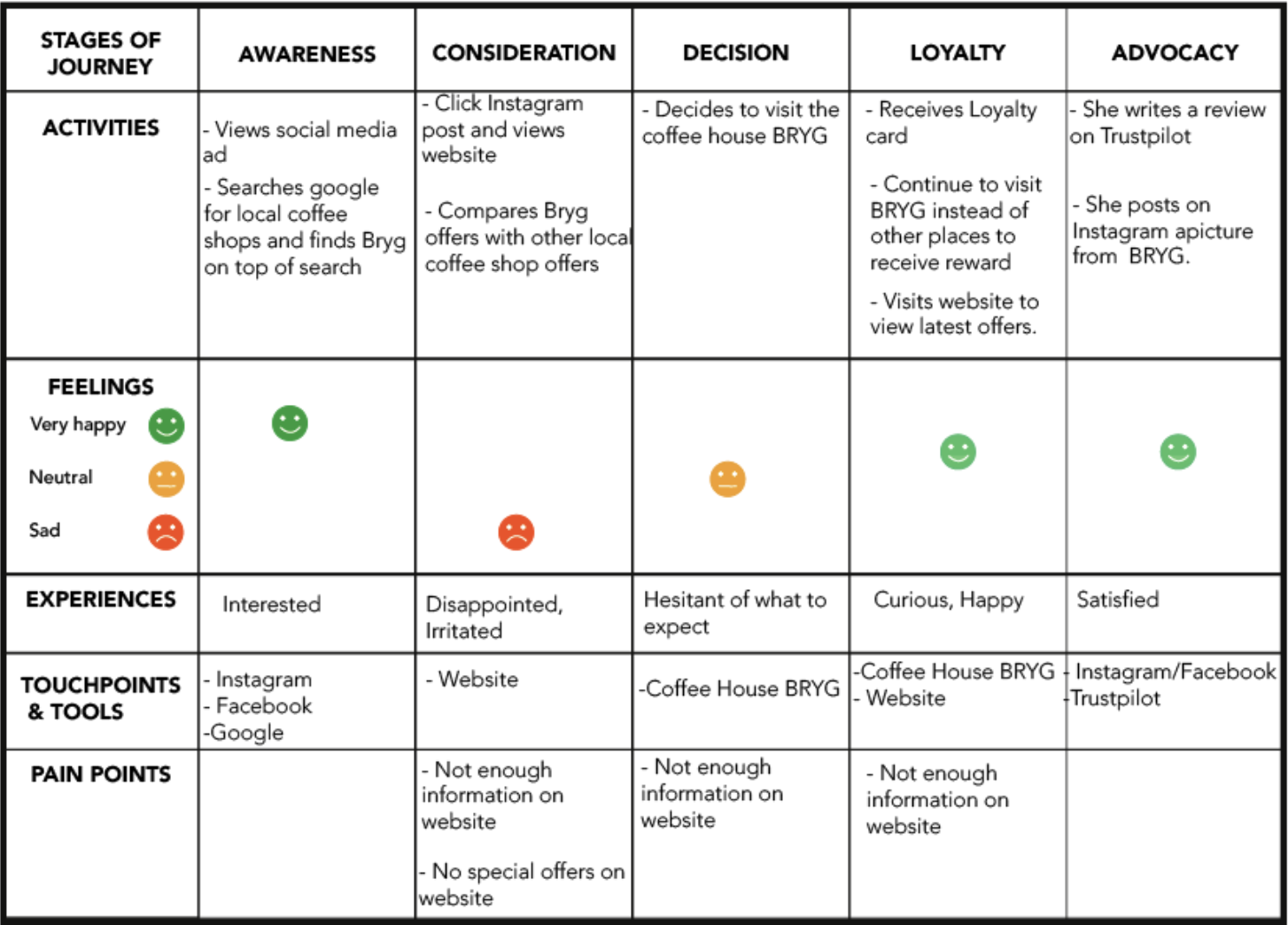
I created Customer Journey Map to better understand customer expectations by identifying the steps that the customer takes, their feelings, touchpoints and painpoints. This is As-is Customer Journey Map which I will analyze and use the information for redesign. I will concentrate on the pain points and how I can solve them in order to create a better experience for customers when browsing the website.
Competitive Analysis
First I looked at the competitors of the Coffee House BRYG and defined the main ones. Drawing from the information from from stakeholder interview, what I found online and survey answers I defined two main competitors – KaffeBaren and Espresso House.
Both of these coffee shops were mentioned in the survey when asked about the favorite coffee place in Vejle and they came up in Google search when searching for “best coffee in Vejle” and they were mention by the stakeholder as the main competitors as well. Both shops are located nearby the Coffee House BRYG. Interestingly, both of them have completely different concepts – KaffeBaren local coffee shop with target audience 40+ with emphasis on coffee quality. Whilst Espresso House is more modern, for younger target audience and most importantly it is a part of a huge coffee shop chain.
4. DESIGN

Prototype Development
For prototyping I used AdobeXD because it can be easily used with other Adobe Software.
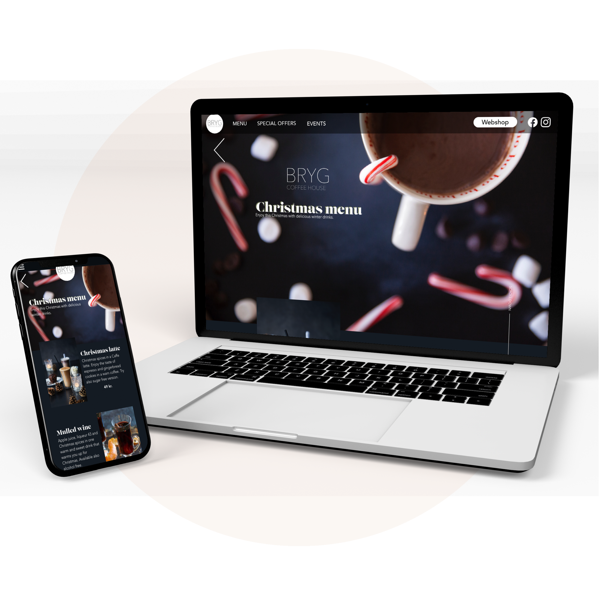
I started with designing the HOME page of the website. I kept some of the brand colours, but gave the website more sophisticated look by making it darker than original. I used different psychology tricks to make sure that the website feels attractive and users want to explore it. I tried to keep the website simple, informative and attractive.
Design Specifications
Regarding the Design specifications and Design System of the company I was given only 5 brand colour codes to follow. For website prototypes I used screen width size 1366px and for mobile prototype I used screen width size 414px (Iphone 6,7,8). In addition I used grid systems to make sure that the design will turn out easy to view and to keep different features aligned
User Psychology
I used psychology to create a better redesign of the website. I used deeper colours, like very dark blue (almost black) to create a feeling of sophistication of the brand. The existing website contains a lot of grey colour which makes it feel and look very ordinary and not stand out.
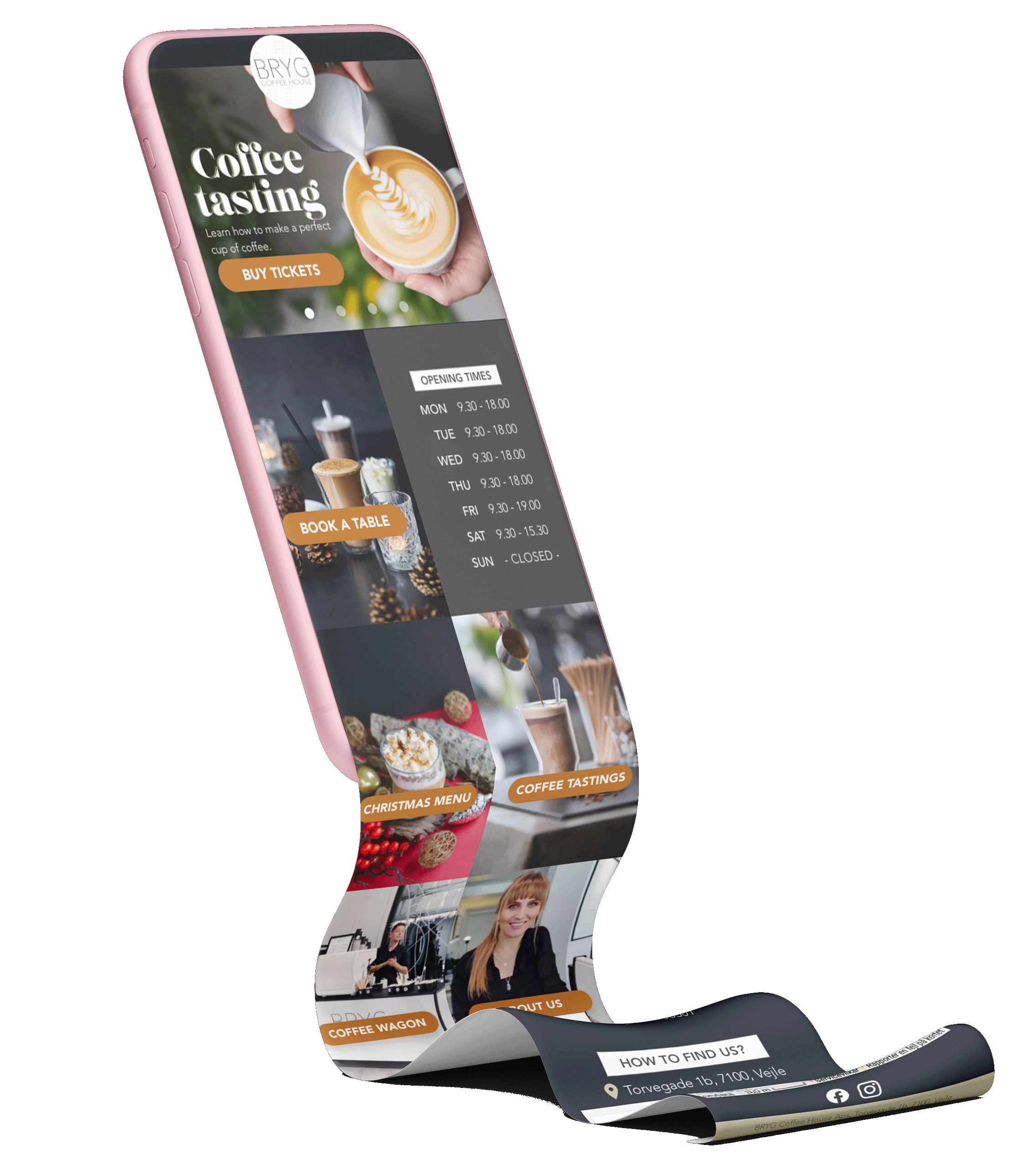
I added few call-to- action buttons (CTA) to make the users want to click around the website and to urge them to find out more. In addition, on the top of the Home page I inserted advertisements of the most interesting offers – Christmas latte, Loyalty card, Coffee Wagon and Coffee Tastings- to draw user attention to them.
Also I used some pictures of peoples faces, for example, for About Us section I used a picture of the owner and for the advertisement with Coffee Wagon I used picture with barista and a customer, to give the user feeling of familiarity and reassurance.
Furthermore I applied Jon Yablonski UX laws to website. For example, I used Fitts’s Law to make sure that buttons are easily clickable and reachable. Also Jakob’s Law was used by applying similar features as large coffee shop chains use to make sure that the website meets users expectations.
5. VALIDATION

User Testing
Using the prototype I have created I conducted one user test as required. The user is: woman, age 37, danish who visits coffee shops approximately 2 times a week to have coffee /meet with friends. During the user test both the mobile version (using the Adobe XD app) and website was tested.
During the user test I asked the user:
• to find opening hours of the coffee shop,
• to find the price of the mulled wine
• to find address of the coffee shop
• name what what reward to customers get
• find the link to webshop
Results: User test went better than expected. What I noticed was that the size of the buttons on mobile version are a little to small as they are harder to press. To correct that I would suggest to make the whole picture clickable during the coding. Overall the user was able to quickly find all that was asked. When the prototype for all website and mobile site is finished I plan to redo more user tests to see how users are able to navigate around it.
WANT TO SEE MORE?
